Brand Guidelines
Starfish Ad Age
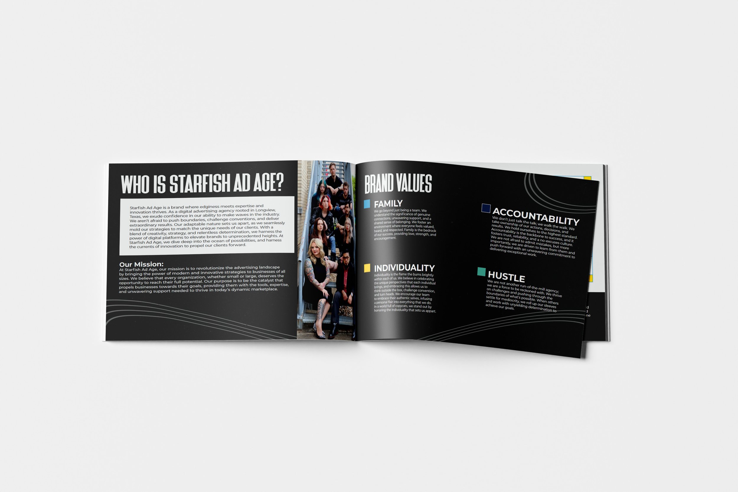
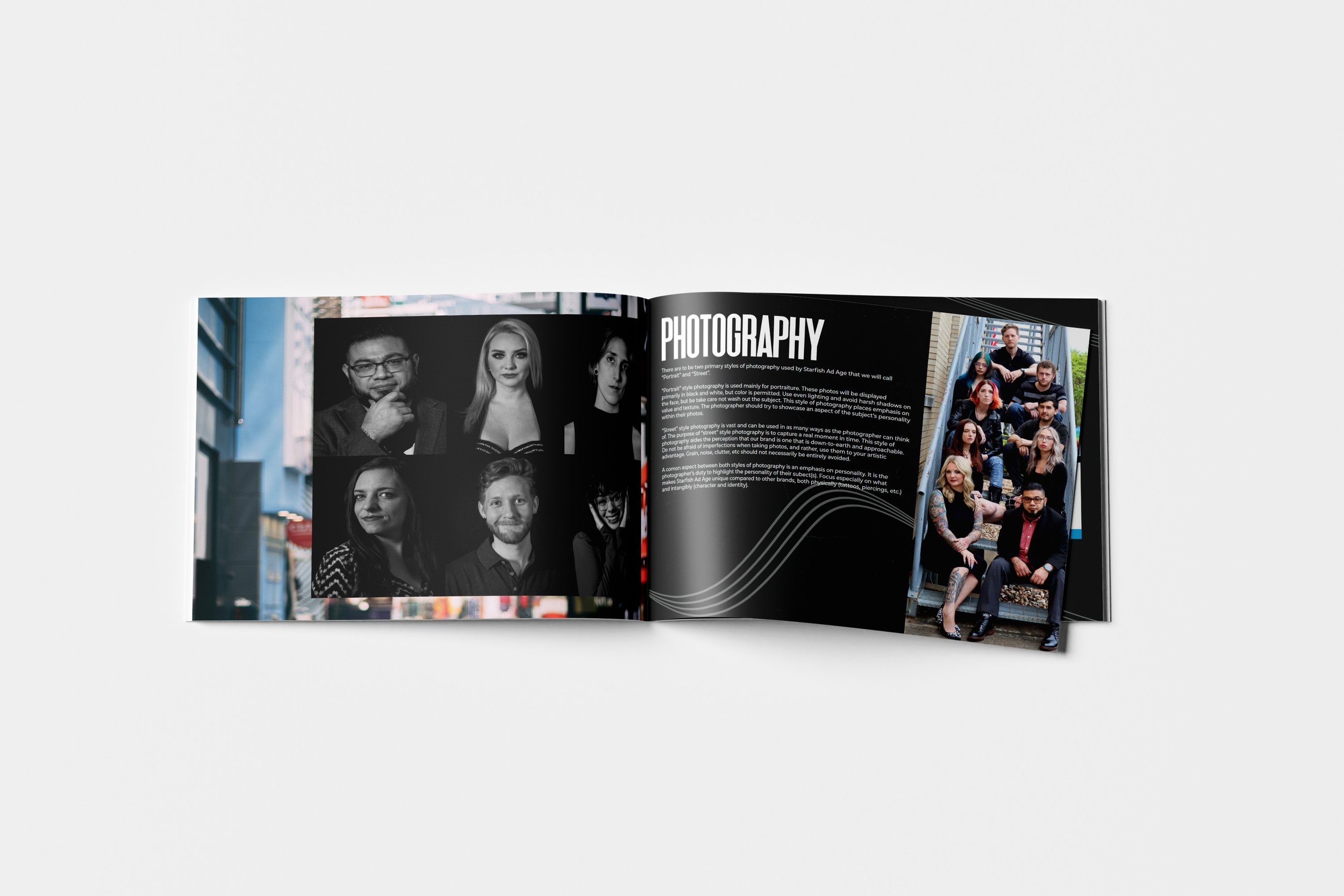
In my time as Creative Director at Starfish Ad Age, I took it upon myself to refresh our visual identity with a new and more authentic look. The purpose of this rebrand was to make Starfish Ad Age stand out among its competitors, and solidify the company as the go-to agency for digital advertising. It was my goal to redefine Starfish's visual identity to reflect its unique position as a relatable, down-to-earth agency.
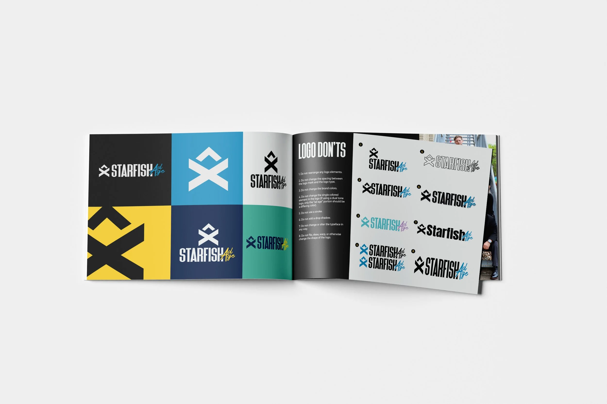
I drew heavy inspiration from the visual style and flair present around the grunge music scene, a genre that has heavily influenced the owner of the company, as well as many of its employees. And while drawing inspiration from the past, I also wanted the visual identity to remain contemporary, ensuring the longevity of the brand and positioning them as a forward-thinking and innovative company. This revamped logo and visual style serves as a beacon for businesses seeking a marketing partner that dares to be different, and ensures that Starfish Ad Age stands out in a sea of conventional agencies.


